Logo and brand identity for AKA Cargo Inc, a trucking company
AKA Cargo Inc is a US trucking company. We designed its logo and brand identity: a blue wing mark that points forward, a strong wordmark, a palette and type, and the way it all looks on the truck, on business cards and on screen.
Published November 12, 2026
A trucking company meets most of its future clients and drivers on the road. A truck passes at 65 miles per hour, and in that second the name on the trailer has to be read and remembered.
For AKA Cargo Inc we built a logo that works in that second and a brand identity that carries it from the trailer to a business card and a website.
The task
AKA Cargo needed a logo that looks like a serious carrier: something a shipper trusts with a load and a driver wants on the door of their truck.
It had to read from far away on a moving trailer, stay sharp at the size of a DOT number, and look equally strong on a white trailer, a black tractor and a phone screen.
The concept: a wing pointing forward
The mark is built from three blue blades that form a wing, angled forward like an arrow. Three ideas sit in one shape:
Speed
The blades lean forward, so the mark looks like it is moving even on a parked truck.
Direction
Together they form an arrow: freight going where it should, on time.
Strength
A bold AKA wordmark next to the wing, with CARGO INC set in wide spacing below.

Colors and type
The palette runs from near-black to bright blue. The dark end keeps the brand serious, the blue gives it energy, and the light gray keeps layouts clean.
Night#111319
Deep blue#0C3EAF
Sky blue#3079CD
Light#F7F7F7
The type is Gotham: Medium for text and Bold for headlines. It is wide, geometric and easy to read on a trailer and in an email signature alike.
Light and dark versions
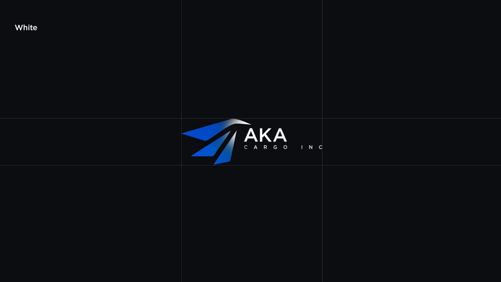
The logo comes in two versions: dark lettering for light backgrounds and white lettering for dark ones. The blue wing stays the same in both, so the brand is recognized on any surface.
On the truck
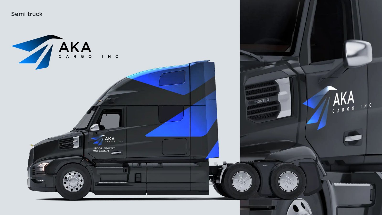
The truck is the biggest brand surface a carrier has. On the black tractor, blue blades run up the sleeper and repeat the shape of the logo, with the full logo on the door next to the USDOT and MC numbers.
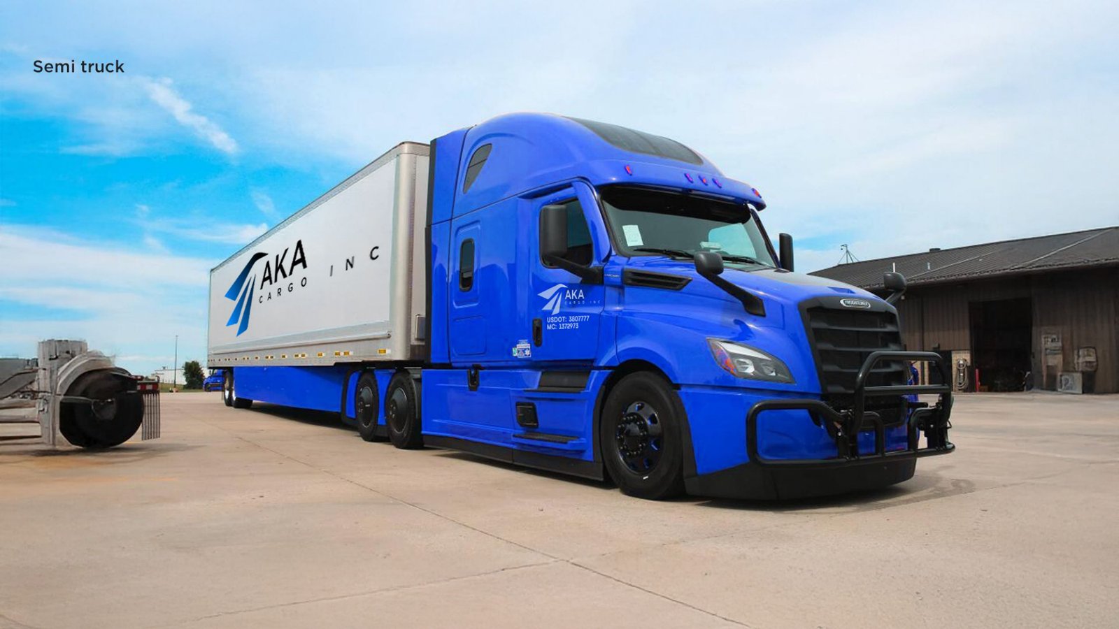
On the real truck, the logo sits large on the trailer and on the cab, readable from the next lane.
Business cards
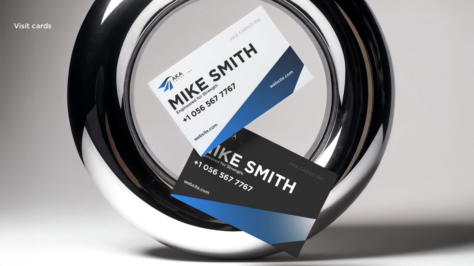
Two cards, light and dark, with the same blue blades cutting across the corner. Name and phone number come first, set large in Gotham Bold.
On screen
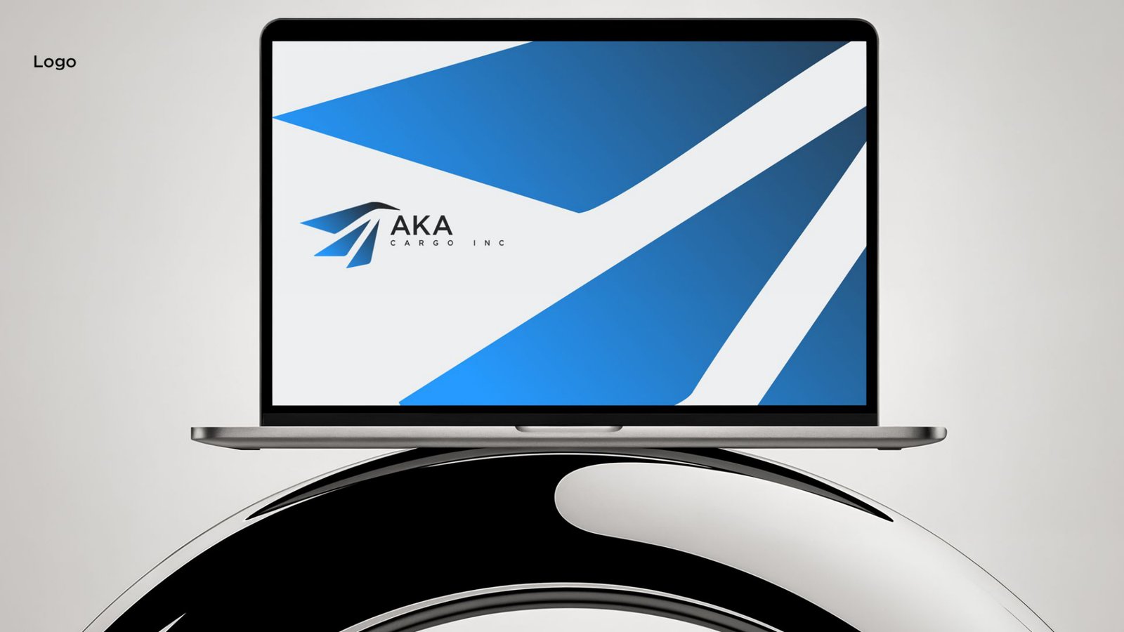
The same shapes scale up into a website background and presentation slides, so the brand looks the same on a laptop as it does on the highway.
The result
AKA Cargo Inc got a logo that reads at highway speed and a brand identity that works on every surface the company uses: the truck, the business card and the screen. Every piece shares one mark, one palette and one font, so the company looks the same everywhere a shipper or a driver meets it.
See more of our trucking logo and brand identity work, or read how we run social media and Meta Ads for a carrier.
FAQ
What should a trucking company logo include?
A clear mark and the company name that both read from a distance and at small sizes. For AKA Cargo Inc that is a blue wing mark, a bold AKA wordmark and CARGO INC in wide letter spacing.
Why do trucking companies use blue in their logos?
Blue reads as reliable and calm, and it stays visible on white trailers, dark tractors and screens. AKA Cargo’s palette runs from near-black to bright blue so the mark works on both.
Can the logo be used on a truck wrap?
Yes. The AKA Cargo mark was designed for the cab, the sleeper, the trailer side and the door, and it scales from the full trailer down to the DOT number area.
What does a trucking brand identity include besides the logo?
For AKA Cargo Inc: the color palette, typography, a light and dark version of the logo, the truck wrap, business cards and digital layouts.